
“Inkscape” Logo Concept

Inkscape is a free, open source, multi-platform vector graphics editor, and I felt their identity was in need of some updating. The goal here was to pay homage to the original design while achieving an original, exciting look. The new mark works on many levels: it forms the letters “i” and “s,” it “flows” like ink in a way that references the original mark, and it also works as a human figure combined with an infinity symbol, representing the endurance of open-source software and its essence as a community project powered by individuals.

Old vs. new.

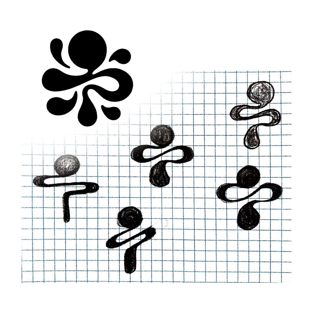
Preliminary and unused sketches / ideas.